

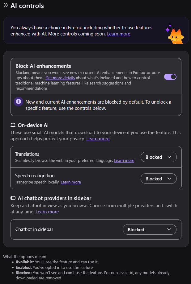
I’m sorry, I’m not often someone to whine about Firefox UI. Usually their changes have been for good actually. BUT! But but but. Proper UI design would require AI features to be disabled if the toggle is disabled. This is both highly silly and very confusing.
For the record, I know it was marketed as “AI killswitch”. I know it functions as one.
But it’s still hella confusing as presented in the configuration! Don’t do double negatives! If your design goal is “disable everything”, maybe give the users the option to, I don’t know, “disable everything”.
Isn’t that what it does? Except in your mind it would say “enable ai” and you’d have to enable it to access the options below.
That makes sense to me
It’s a dark pattern to confuse those who don’t read word by word. In daily life, if i have to turn on the switch to switch off the light, it just wouldn’t make sense, unless when it’s intentionally want to confuse and make you switch on the light.
An On/Off switch for AI Enhancement reads significantly better than On/Off switch to block AI Enhancement, the first one is just basic intuition.
Totally, they really should change those ad blocker buttons. Off to indicate ads are off right? Definitely not ‘on’ to indicate that ads have been disabled. Because that would be too confusing for people.
Is this AI Blocker 3rd party plugin or first party setting? In the same sense if those ad blocker are first party stuff that’s build into, say, youtube or news site, then yes, that would totally be a better option, off to turn off ads, on to turn on ads. If it’s third party tools made literally to turn off ads, then it make sense to turn on to block ads and turn off to allow ads. Common sense, yeah?